But this is a real post.
- Neil Googe

- Jun 17, 2020
- 3 min read
But still more a test to see how easy the blog is on here...
As well as how it looks. Plus it gives me a chance to tie it to my first e mail newsletter thing... Oh and I did try text in orange but while I like the contrast throughout the site, not so keen in a blog post for some reason. Maybe I'll just use it for a highlight or a...
Quote
Hmmm... wasn't keen on the quote styling until I carried on typing. Not so bad in amongst the rest of the post.
This is the Cover image, seems its just the first image you add to a post. And this is the cover image in stretched size format. Works well for the cover image...
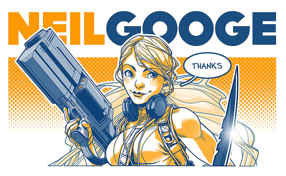
although having now previewed the post, I don't like the way the image breaks the border this size. Having also checked the preview, none of the text color changes work. I need to sort that
Although the first image doesnt have to be the cover, I can change it at the side it seems.
So that is just a test image that you've all seen before, but I am just testing a post. It's also the image used when someone shares the web site. Although you've not seen these images below before... well, unless you saw them on instagram etc. before seeing them here.
Thats not the image... thats a divider. Wish I could change the color of that, but I can't find a way to do it.
This is the image. And this text is a test of alignment.

So this is a band aid graphic based on a rather notorious part of Jules original costume. And while she no longer has that costume, this is an image that appears in many places throughout the comic as merchandise that Jules herself produces.
Little known fact. I actually lived in the house where the man who invented the band aid also lived. True story.
So this is another image...
Dividers definitely help if theres not a block of text between two offset images.
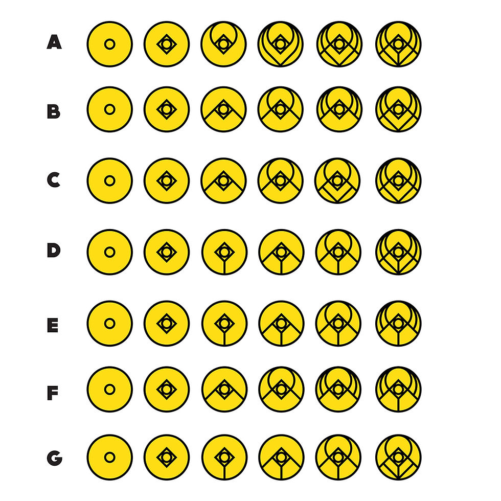
So this time I want to test a left hand text, right hand image. Ok so this image is a series of icon tests for the coming patron campaign. All people who support the campaign get to become members of a group called the Patrons.
The higher their devotion, or commitment to the group, the higher the rank. Each evolution of the first icon, is an aditional rank. From follower through to adherent.
Looking at these, I will likely go with row C, D, E or G. I havent decided which yet. I'll likely put it too a community vote. First part of the community participation that I want to be a large part of the project.
Okay, I think that about covers it for this test post. That was pretty simple and painless and I like the end result. Wix is proving to be so much better the option for my needs.
Ok, and that divider, a different one, marks the end of my test... well... that and the same image up top on post width rather than stretched.

ok... and one final image tested at small fit. And all the sizing works surprisngly well... really want to figure out how to change the color of those dividers though.

And like the little lady in the picture says... Thanks
ooh, that divider works well to mark the end of the post ;)



Comments